Translating this theoretical approach into its practical implementation was probably the most rewarding part of the project. Deep down we're all still all very close to our ancestors, wanting to stand on a hill and see where the antelopes and lions are, born with an original sin of too small of a frontal cortex and too small of an amygdala.
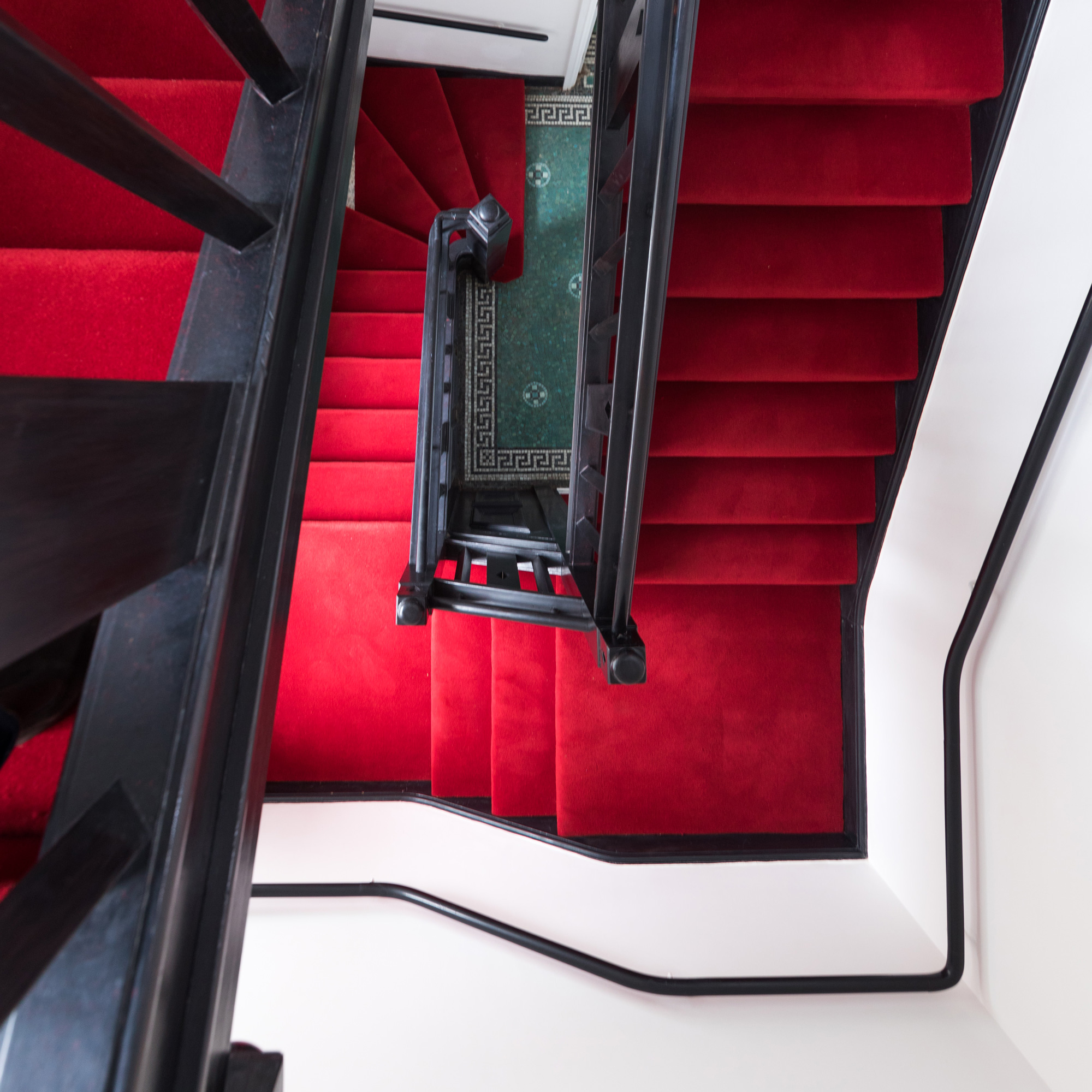
This often overlooked requirement for people to feel comfortable meant a strong focus on lines of sight and auditory barriers, the general layout of buildings, in their initial selection all the way to their adaption. All sites featured either independent buildings, or multiple stairways, careful incorporation of vantage points, the possibility to get an overview of what's happening where, and to get from A to B by consciously joining or avoiding people.
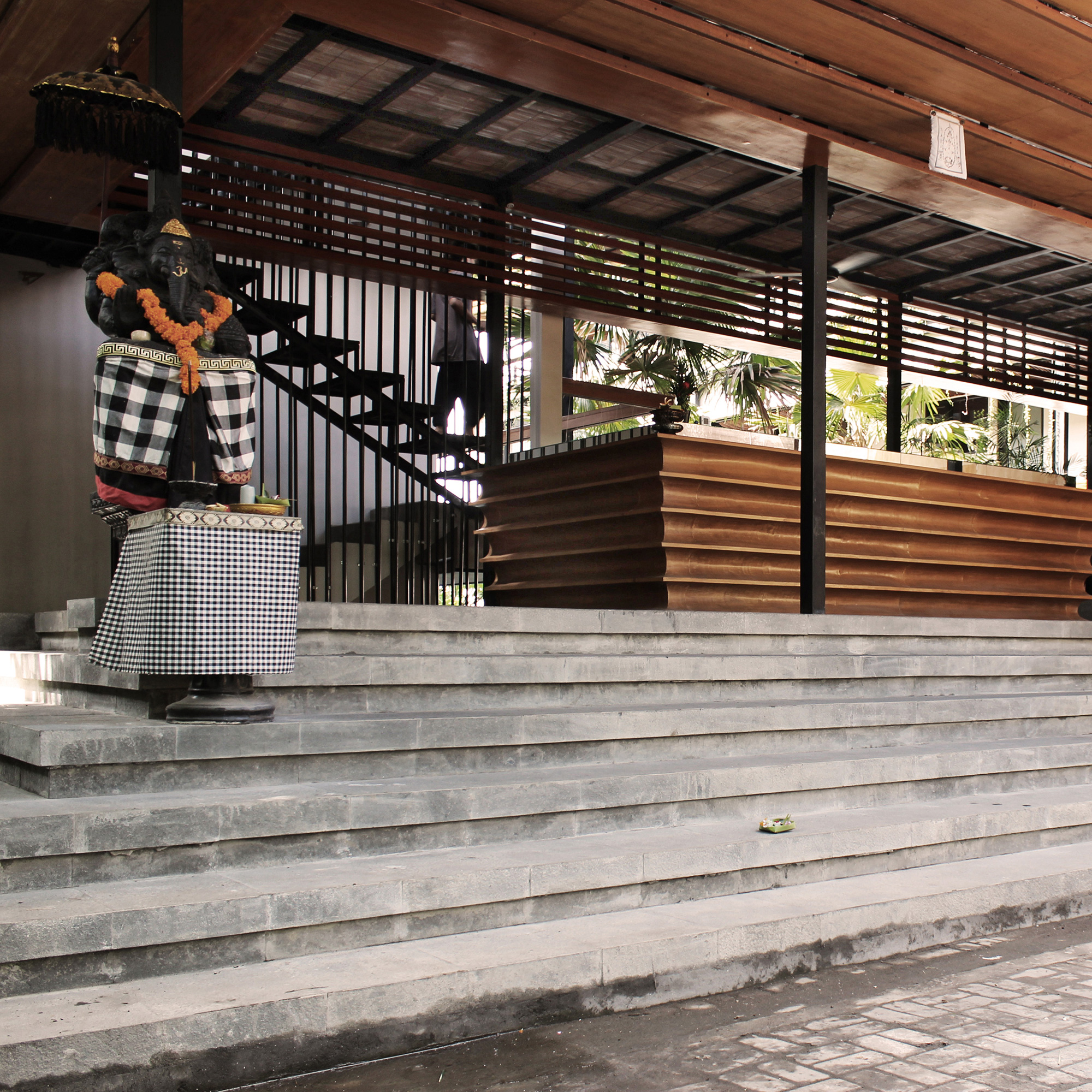
The ability to get to your personal space with ease, even in more constricted spaces like the Central London site: seeing who is in the coworking area, but not having to talk to anyone as you pass by, because it's behind soundproof glass - depending on how you feel in that moment. To grab a coffee early in the morning without having to make it all the way to the publicity of the commercial kitchen studio. Bali also was a prime example: the various buildings surrounding the central pool area were connected by multiple skybridges and stairwells, while the rooftop areas allowed a good sense of who was where, if in public, and small front porches with frosted window elements gave a feeling normally associated with small towns. There's a lot of discussion around wellness in residential, but we found that those more basic elements did significantly more than random amenities.
Signs as a Sign of Failure
This approach of not enshrining rules for guests also extended to the physical spaces: whenever local teams felt it necessary to post a sign telling people to do x or not do y, instead of doing so they filed a corresponding internal ticket which became a design issue to resolve. It was never the guest's fault, it was a lack of good design.
Based on the initial specifications and constant learnings, we worked with the Roam team to develop a list of roughly 400 items, from furniture to small utensils, their exact features and placement, making sure that everything served a clear purpose without being confusing, difficult to find, or hard to use. And because they were mostly functional specs, they allowed for local aesthetics and variation.
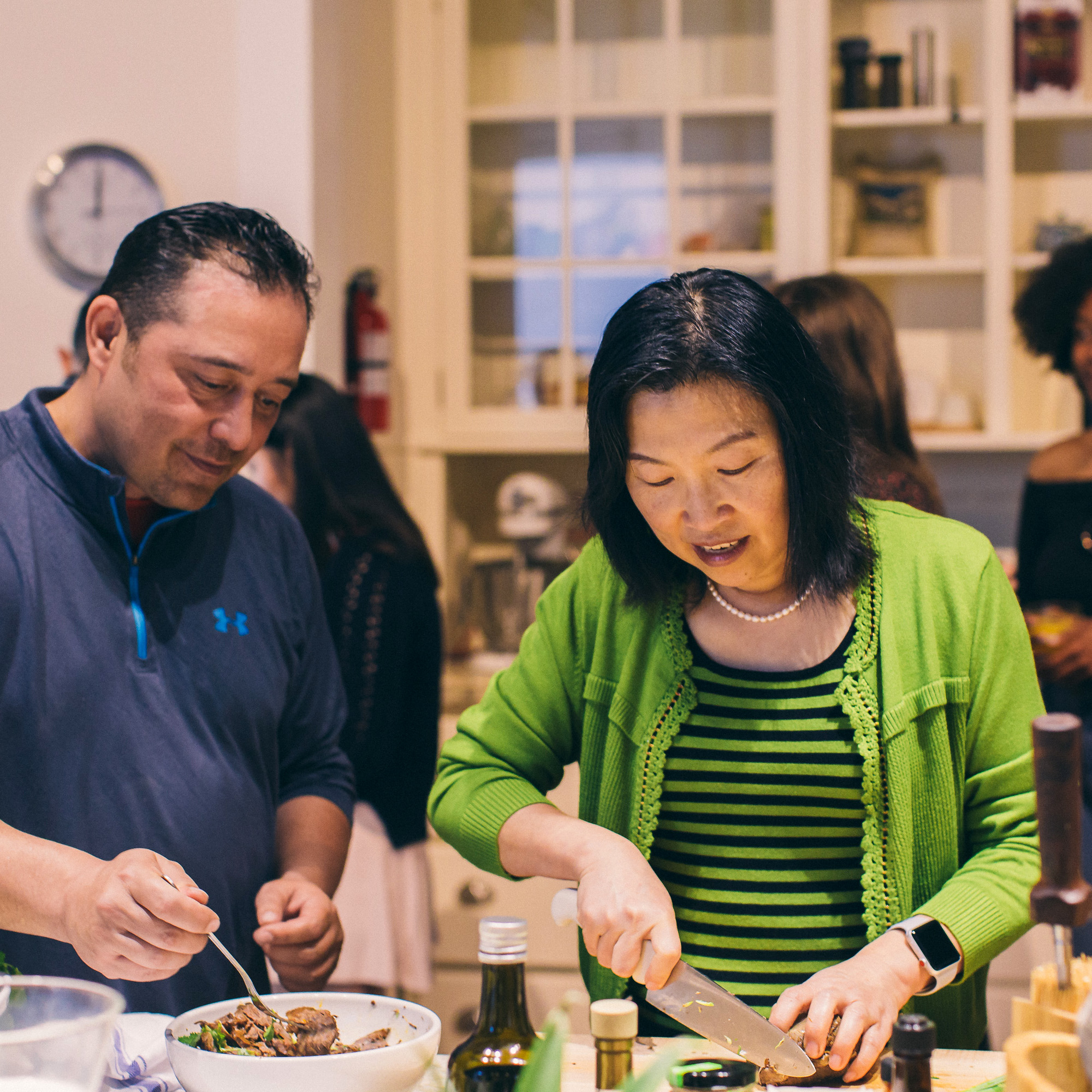
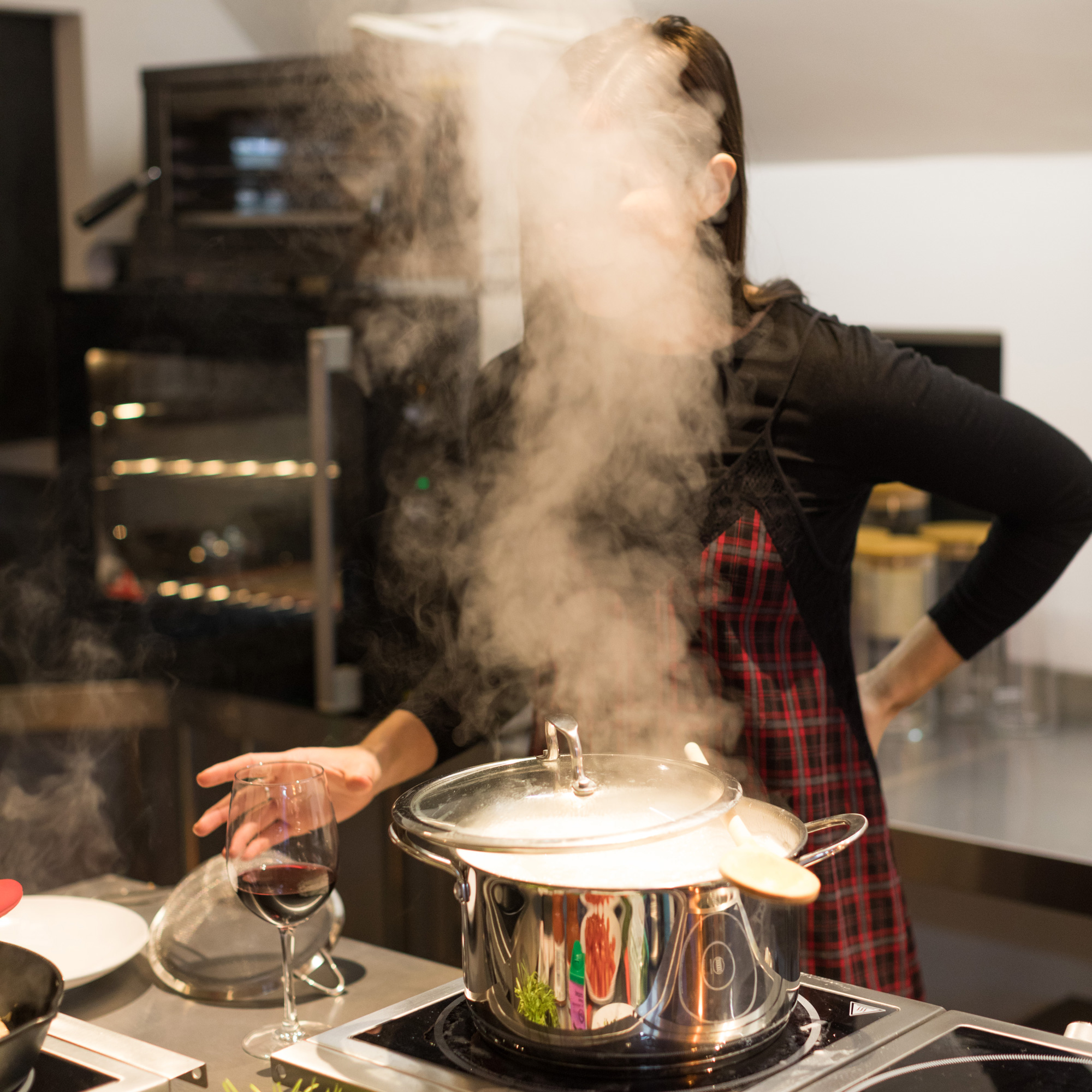
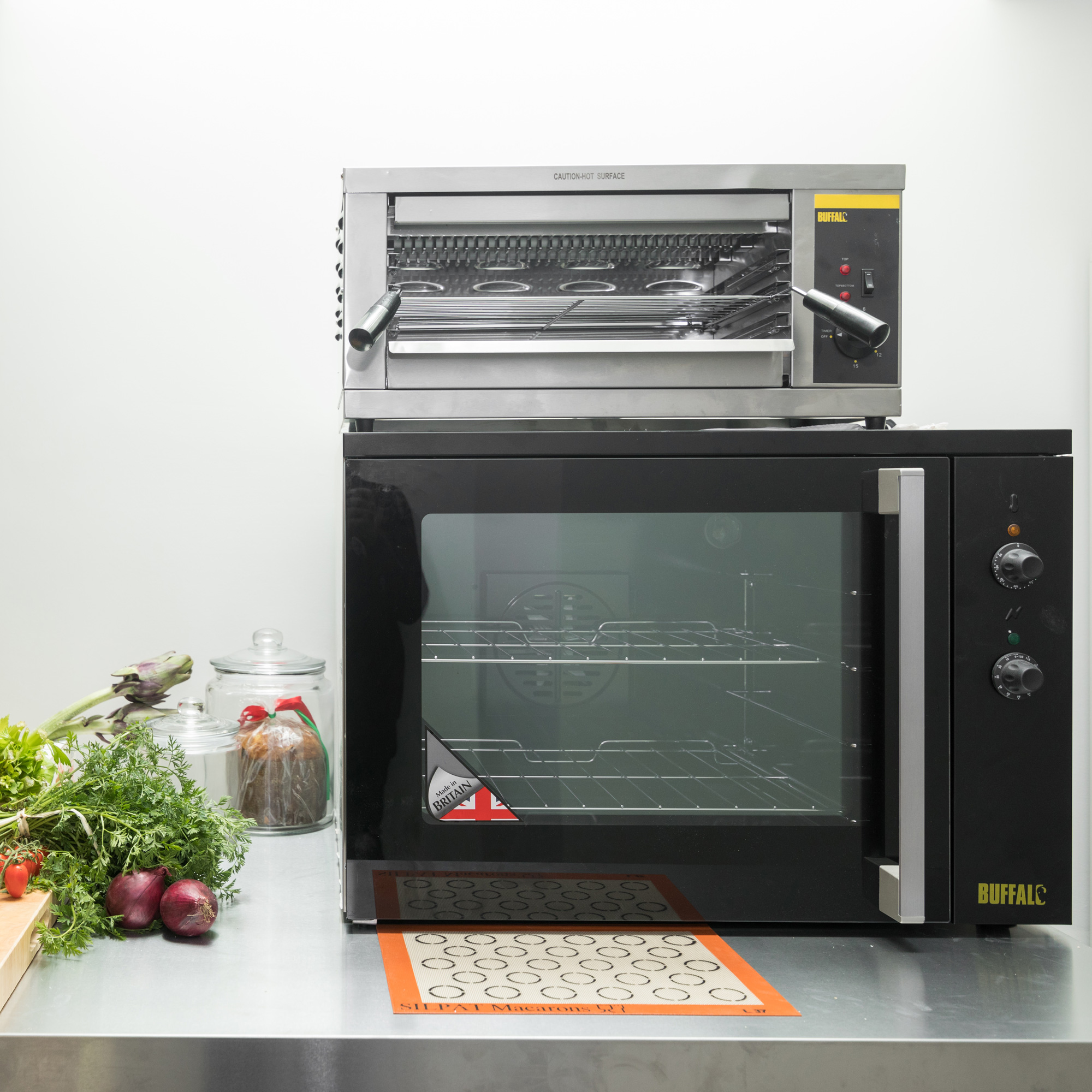
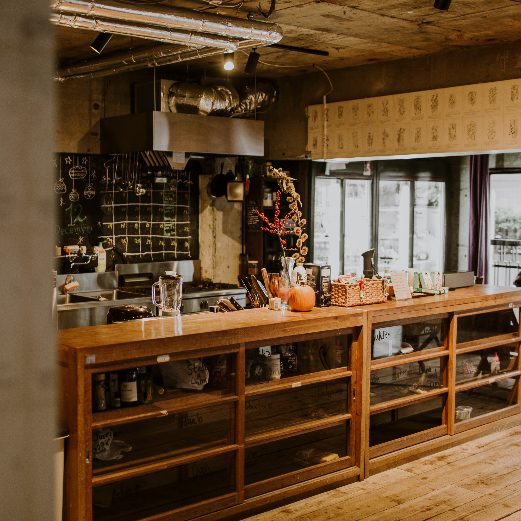
The kitchen studio is again a good example here: learning from decades of professional kitchen experience, everything was structured by cooking functions, from prep to sauté, areas for cold items like salads to baking, with all the respective tools and utensils clearly in sight, and every appliance simple and intuitive - including commercial dishwashers making sure that cleaning was a breeze.
This allowed Roam to reduce the housekeeping workload to two 30 minute resets, at the beginning and end of a single morning shift, while keeping the spaces pristine throughout the day - being messy would have simply been more effort for anyone than just keeping things tidy and friendly.






 Sending...